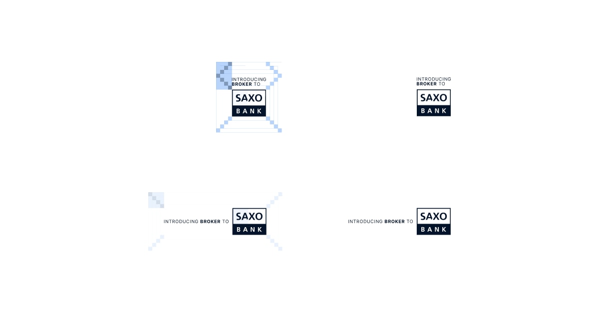
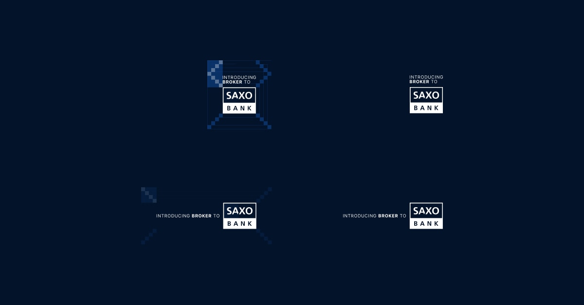
The following graphical guidelines are intended to help you reference your relationship with Saxo in the right manner.
Using the right Saxo logo for your background
- Please use the version that is suited to your colour output and do not colour convert.
- White logo should be used on a dark background (primary logo)
- Blue logo should be used on a light background
| White logo (primary) on dark background: | Blue logo on light backgrounds: |
 |
 |
Clear space and sizes
- The Saxo logo should never be overcrowded by, or linked to, other elements that will reduce its legibility and visibility.
- In order to ensure absolute recognition, the logo must always be surrounded by an area of clear space that no other graphic elements or objects should intrude.
- The recommended area must never be reduced but can be increased.
- The amount of clear space varies in direct proportion to the size of the logotype, with the indicator area as the definition of X / level 4.
- Logo minimum sizes:
- Online: minimum width 32px
- Offline/print: minimum width 19.2mm (ai. logo 80%)
Logo variations allowed


Download "Introducing broker to"
White logo (Dark background):
Blue logo (light background)
Download "Powered by"
White logo (Dark background):
Blue logo (light background)
Rules for using the logo
- Please send your marketing collateral using the co-branding guidelines to your account manager and INST-Marketing@saxobank.com for approval.
- Remember to always use the logo files provided and do not recreate them.